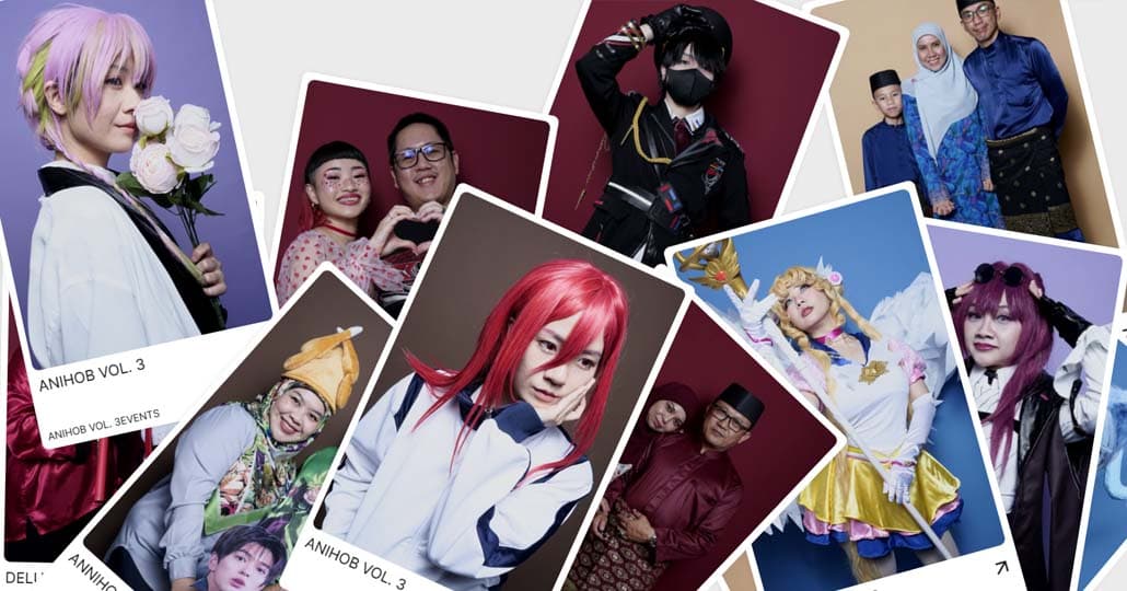
Brand Guidelines
This guideline is the single reference for how Lumora Studio and lumobooth present themselves. It explains what we stand for, how we sound, and how our logo, colour, type and imagery work together, so that every piece of marketing looks and feels like it came from one team, one identity.
A consistent brand is recognised faster and trusted more. Every poster, post, price list and web page either builds that recognition or weakens it. This guideline removes guesswork, so decisions about layout, wording and imagery are quick and consistent.
A consistent brand is recognised faster and trusted more. Every poster, post, price list and web page either builds that recognition or weakens it. This guideline removes guesswork, so decisions about layout, wording and imagery are quick and consistent.
Contents
01 Brand Strategy
02 Personality
03 Logo
04 Color
05 Typography
06 Art Direction
01 Brand Strategy
Who we serve
Lumora is for people who want to be photographed well without feeling watched. That includes students and graduates marking a milestone, couples and married couples, families, cosplayers and creatives who care how they’re seen, and the groups at corporate events, birthdays and weddings who want something memorable to take home. What they share is not age or occasion. They want a good photo and the freedom to take it their own way.
Lumora is for people who want to be photographed well without feeling watched. That includes students and graduates marking a milestone, couples and married couples, families, cosplayers and creatives who care how they’re seen, and the groups at corporate events, birthdays and weddings who want something memorable to take home. What they share is not age or occasion. They want a good photo and the freedom to take it their own way.
Our promise Studio-quality portraits, on the spot, taken by you, in a private space where you feel safe being yourself.
Mission To make professional-quality portraits personal, private and instant, so anyone can be photographed the way they want to be seen.
Vision To become the place people go for portraits that feel like them, whether in the studio or at their own event.
Positioning Most photo services put a photographer between you and the camera. Lumora removes that layer. Lumobooth gives you studio lighting, a private booth and full control of the shutter, so the result is natural, unposed and yours. We are not a photographer you book or a novelty photo booth. We are a self-portrait studio, a studio-grade experience that you run yourself.
Brand pillars
Private. A safe, comfortable space where nobody is watching and nobody is judging.
Self-directed. You choose the pose, the pace and the moment. We provide the studio, and you decide what happens in it.
Studio quality. Professional lighting and results, delivered on the spot, with no waiting.
Portable. Lumobooth goes where the occasion is, from our studio to your event.
Brand values
Authenticity: we value real expression over perfect poses.
Comfort: every decision starts with how the customer feels.
Craft: simple to use, carefully made, consistently good.
Inclusivity: every person, culture and style is welcome in front of the camera.
Two ways people meet us
Individuals and groups come to the studio for personal moments. Event hosts and companies rent Lumobooth for guest experiences. Marketing for each should speak to a different need (personal expression versus a memorable event), but the promise and the voice stay the same
Mission To make professional-quality portraits personal, private and instant, so anyone can be photographed the way they want to be seen.
Vision To become the place people go for portraits that feel like them, whether in the studio or at their own event.
Positioning Most photo services put a photographer between you and the camera. Lumora removes that layer. Lumobooth gives you studio lighting, a private booth and full control of the shutter, so the result is natural, unposed and yours. We are not a photographer you book or a novelty photo booth. We are a self-portrait studio, a studio-grade experience that you run yourself.
Brand pillars
Private. A safe, comfortable space where nobody is watching and nobody is judging.
Self-directed. You choose the pose, the pace and the moment. We provide the studio, and you decide what happens in it.
Studio quality. Professional lighting and results, delivered on the spot, with no waiting.
Portable. Lumobooth goes where the occasion is, from our studio to your event.
Brand values
Authenticity: we value real expression over perfect poses.
Comfort: every decision starts with how the customer feels.
Craft: simple to use, carefully made, consistently good.
Inclusivity: every person, culture and style is welcome in front of the camera.
Two ways people meet us
Individuals and groups come to the studio for personal moments. Event hosts and companies rent Lumobooth for guest experiences. Marketing for each should speak to a different need (personal expression versus a memorable event), but the promise and the voice stay the same
02 Personality
Lumora is the friend who makes everyone feel at ease in front of a camera, funny enough to make you laugh and reliable enough to trust with your big day.
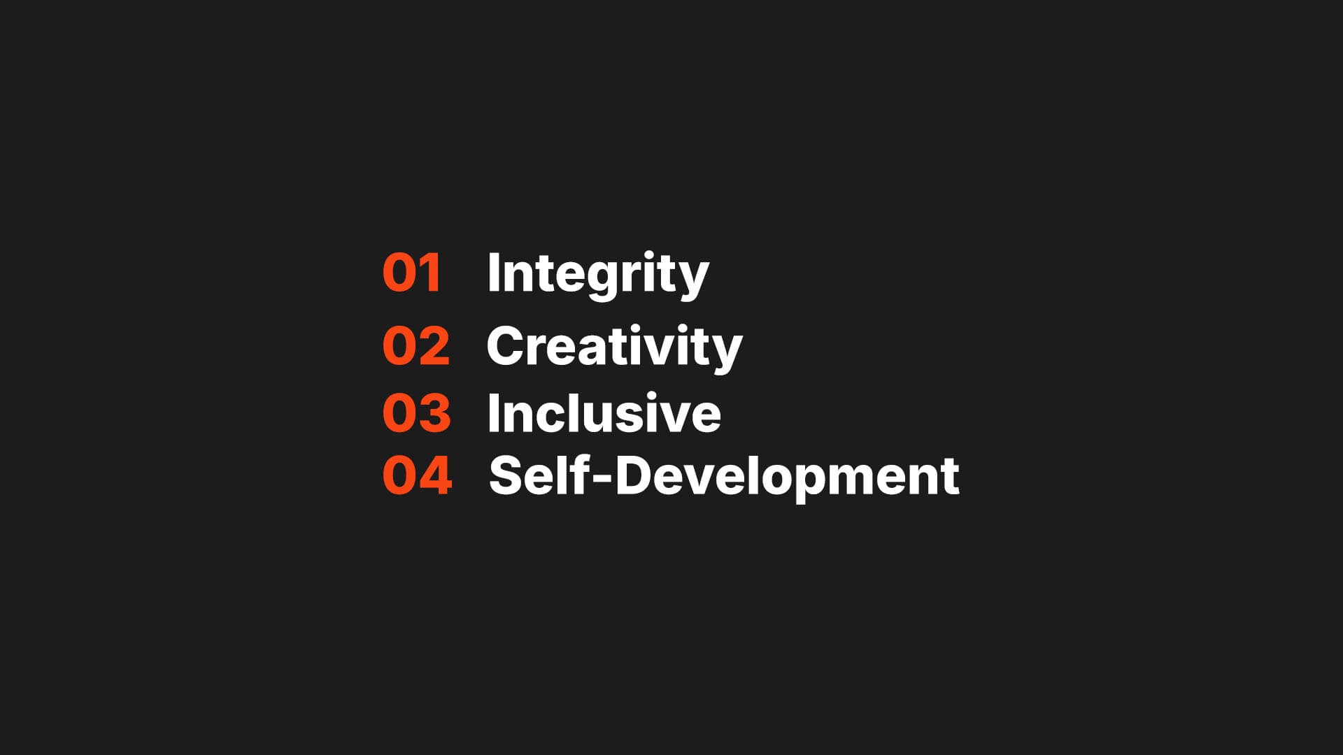
Tone & Voice
Voice is who we are, and it stays the same everywhere: warm, witty, caring and clear. Tone is how that voice adjusts to the situation.
Talk like a person.
Short sentences, everyday words and contractions. If you wouldn’t say it out loud, don’t write it.
Lead with the benefit.
Say what the customer gets (private, instant, studio quality) before how it works.
Make comfort visible.
Mention privacy and ease wherever they’re relevant. They’re the core of our promise.
Keep humour light and optional.
One good line beats three. If a joke doesn’t make the message clearer or friendlier, cut it.
Be specific.
“Studio-quality photos in minutes” says more than “amazing photos.”
Do and Don’t
Do
Use “you” and “we” and speak directly to the customer.
Use light Gen Z touches (casual phrasing, playful asides, the occasional emoji) where the context allows it.
Keep calls to action simple and friendly: “Book your session,” “Get your Lumobooth.”
Use light Gen Z touches (casual phrasing, playful asides, the occasional emoji) where the context allows it.
Keep calls to action simple and friendly: “Book your session,” “Get your Lumobooth.”
Don’t
Stack slang or force trends. If the phrase will date in six months, skip it.
Joke about appearance, bodies, age, culture or religion.
Use corporate jargon like “leverage,” “solutions” or “synergy.”
Use humour in apologies, serious issues or pricing and policy details.
Joke about appearance, bodies, age, culture or religion.
Use corporate jargon like “leverage,” “solutions” or “synergy.”
Use humour in apologies, serious issues or pricing and policy details.
Language
Primary language: British English
All headlines, captions, pricing and customer communication are written in natural, conversational British English.
Bruneian Malay: rare and natural only.
A short, familiar word can add local warmth when it fits, such as “Jom!” in a casual caption or “Terima kasih” in a thank-you message. Never translate whole lines, force slang, or mix languages just to sound local. If it feels like a trying-too-hard moment, write it in English.
Sample Copy
Brand line
Your photo. Your pace. Your space.
Studio headline
Studio-quality photos, taken by you.
Privacy-led headline
Close the curtain. Be yourself.
Instant-results headline
Walk in. Smile. Walk out with your photos.
Announcement
The booth is open and the lighting is unreasonably flattering. Come see for yourself.
Graduation season
You survived finals. The least you deserve is a really good photo. Book your grad session.
Couples
Plus-one? Even better. Bring your person, close the curtain, and take as many shots as you like.
Cosplayers and creatives
Hours on the wig. Weeks on the armour. Give it the studio-quality photo it deserves.
Casual local touch (use sparingly)
Weekend plans? Jom come take some photos.
Event rentals (low humour, polished): Corporate
Give your guests something they’ll actually keep. Lumobooth brings a private, studio-quality photo experience to your event, with no photographer and no queue management needed.
Event rentals (low humour, polished): Weddings
Capture the moments between the moments. Your guests step in, relax and take portraits that feel like them.
Event rentals (low humour, polished): Birthdays
Make the party the one everyone’s still talking about. Lumobooth turns your guests into the photographers.
Service messages: Booking confirmation
You’re all booked in. We’ll see you on Saturday at 2:00 PM. If anything changes, just reply to this message.
Service messages: Reassurance before a session
First time in front of the camera? No pressure. The booth is private, there’s no rush, and you decide when to take each photo.
Service messages: Apology or delay
We’re sorry for the wait. We’d rather get it right than hurry it, and we’ll update you as soon as it’s ready.
Service messages: Pricing line
Simple pricing, no surprises. Choose your package, then take as many photos as your session allows.
03 Logo
The Lumora Studio logo has two parts: a primary lockup and a secondary lockup. Always use the supplied artwork. Never recreate, retype or redraw it.
Primary Lockup
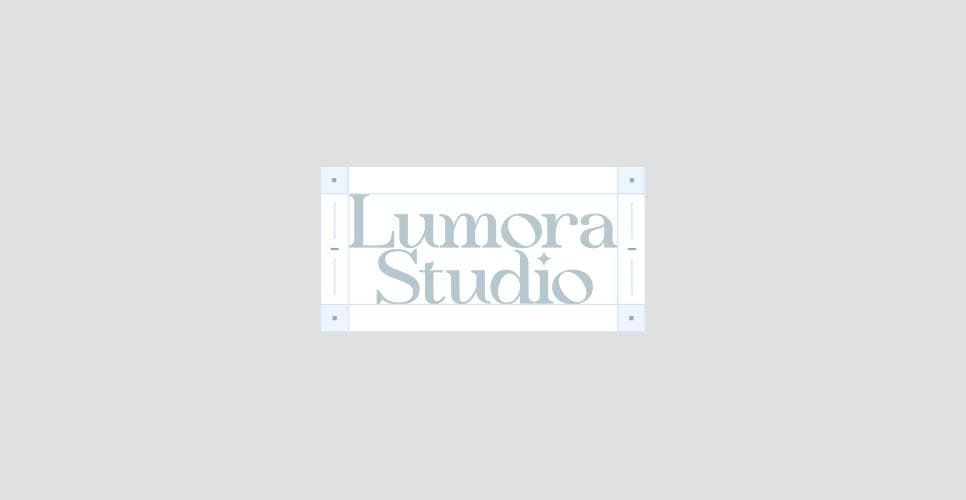
Clearspace
Secondary Lockups

Incorrect Usage
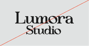
Do not resize the mark
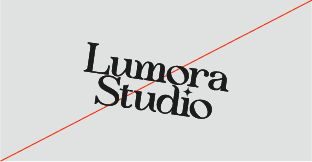
Do not rotate the logo
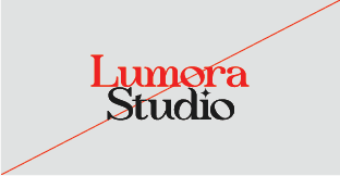
Do not change the color of the mark alone
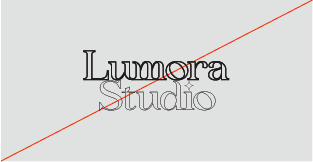
Do not outline the logo
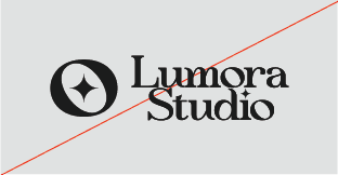
Do not combine with secondary logo
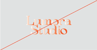
Do not add gradients the logo
Partnerships
04 Colour
Our palette is deliberately small: one bold accent, one deep black and three neutral greys. The neutrals do most of the work, and the orange is the moment that catches the eye. This restraint gives Lumora its confident, editorial look and lets the photography and people stand out.
Primary Palette
Netfacade Orange
#FA4515
Black
#1B1B1B
Secondary Palette
Dark Grey
#54565A
Medium Grey
#9B9EA6
Light Grey
#E0E0E0
White
#FFFFFF
Colour Combination

Black on white

Black on medium grey

White on black

Netfacade orange on black

Netfacade orange on white

Black on netfacade orange

Black on dark grey

Light grey on dark grey
05 Typography
Our typography is simple on purpose. One typeface, Inter, does all the work, and weight and size create the hierarchy. Inter is clean, neutral and highly legible, which lets the logo’s elegant serif and the photography carry the personality. Inter is free and available as a variable font, so it’s easy to use across web, print and social.
Primary Typeface
Inter
Used for headlines, titles, large statements and buttons. Set in Bold (700) and SemiBold (600) with slightly tightened letter spacing, which gives headlines a confident, modern feel.
Secondary Typeface
Inter
Used for body copy, captions, labels and supporting information. Set in Regular (400) and Medium (500) with comfortable line spacing, which keeps longer text easy to read.
Do
Write headlines in sentence case. It feels friendlier than Title Case or all caps, which suits our voice.
Keep text left-aligned.
Limit a layout to three sizes for a clear hierarchy.
Pair type colours carefully: Black or Light Grey for headlines, Dark Grey for body on light backgrounds, Light Grey for body on dark ones. An orange word in a headline is fine on dark backgrounds, as covered in the Colour section.
Use the fallback fonts Helvetica Neue or Arial only when Inter isn’t available.
Keep text left-aligned.
Limit a layout to three sizes for a clear hierarchy.
Pair type colours carefully: Black or Light Grey for headlines, Dark Grey for body on light backgrounds, Light Grey for body on dark ones. An orange word in a headline is fine on dark backgrounds, as covered in the Colour section.
Use the fallback fonts Helvetica Neue or Arial only when Inter isn’t available.
Don’t
Use weights lighter than Regular. Light and Thin lose legibility at small sizes and on dark backgrounds.
Use all caps for anything beyond short labels.
Use italics for emphasis. Use weight instead.
Stretch, outline, add effects to or fake-bold the type.
Use Medium Grey for body text, because the contrast is too low.
Retype the logo in Inter. The wordmark is artwork and always used as supplied.
Use all caps for anything beyond short labels.
Use italics for emphasis. Use weight instead.
Stretch, outline, add effects to or fake-bold the type.
Use Medium Grey for body text, because the contrast is too low.
Retype the logo in Inter. The wordmark is artwork and always used as supplied.
Clear Up Confusion, Gain Peace of Mind
Type Sizes > 72pt/px
100% Leading
-2% Tracking
Whether it’s a bank error, an unauthorized charge, or an overlooked refund, we ensure you don’t pay for something you shouldn’t have.
Type Sizes 55–72pt/px
110% Leading
-2% Tracking
Our team works diligently to recover lost funds, correct inaccuracies, and keep your financial records accurate—so you can feel confident about every dollar in your account.
Type Sizes 24–55pt/px
120% Leading
-1% Tracking
Financial errors shouldn’t slow you down or cause unnecessary stress. Whether it’s an incorrect charge, a duplicate transaction, or a miscalculated fee, we step in to make things right. Our process is simple, straightforward, and designed to get your money back where it belongs—quickly and without hassle.
Type Sizes 0–24pt/px
130% Leading
0% Tracking
06 Art Direction
Lumora imagery looks like confident studio portraits that feel like the person, not the photographer. The photos bring the colour and emotion. Our layouts stay quiet around them, so the people remain the focus.
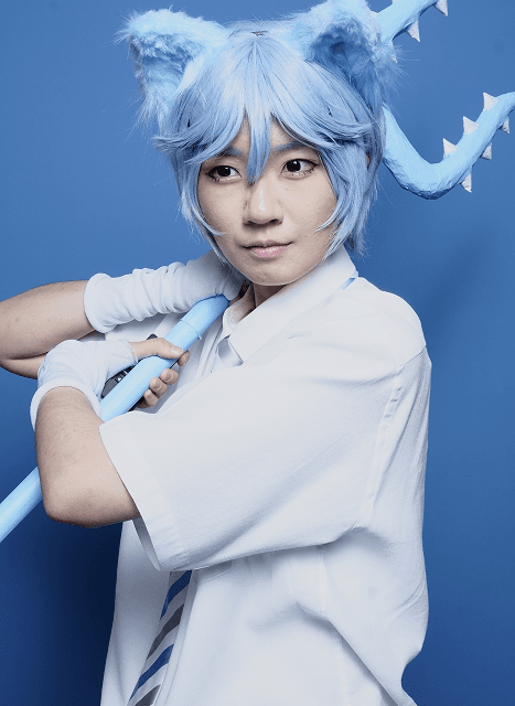
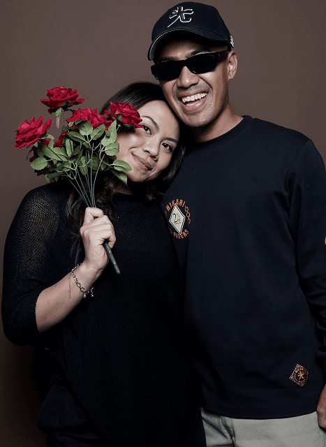
The Lumora look
One solid colour backdrop
Each frame has a single, clean, saturated seamless backdrop, such as deep blue, rich burgundy or warm chocolate brown. The backdrop is the stage. Keep it free of patterns, creases and clutter.
Soft, even studio light
Flattering and gentle, with soft shadows and true skin tones. Light should shape the face without drama or harshness.
Subject-led framing
Vertical (4:5) framing from head to mid-torso or three-quarter length, with the subject filling the frame and a little headroom. Groups are posed close together.
Real expression
A laugh, a wink, a leaning-in moment or a quiet side glance. We favour candid and playful over stiff and formal, which is exactly what a private self-portrait booth encourages.
Styled by the customer
Costumes, traditional attire, matching outfits and props like flowers or a trident are the customer’s own expression. Outfits that harmonise with or contrast against the backdrop look best (teal on burgundy, blue on blue).
Natural finishing
Adjust crop, exposure and contrast only. Keep backdrop colours true and skin texture intact. No heavy filters and no aggressive smoothing.
People and permission
Show the full range of people we serve: couples, families in traditional attire, graduates, students, cosplayers and creatives. Photograph people the way they want to be seen. Only publish a customer’s photo with their permission. Privacy is our promise, so our marketing must honour it.
Photography do’s and don’ts
Do
Keep backdrops solid and clean
Choose genuine, warm expressions
Keep colours true to life
Crop for a strong vertical composition
Keep faces clear and unobstructed
Choose genuine, warm expressions
Keep colours true to life
Crop for a strong vertical composition
Keep faces clear and unobstructed
Don’t
Use busy or patterned backgrounds
Use stiff or heavily staged poses
Apply heavy filters or colour grading
Cut through faces or hands awkwardly
Place text or logos over faces
Use stiff or heavily staged poses
Apply heavy filters or colour grading
Cut through faces or hands awkwardly
Place text or logos over faces
Logo on photography
When we add our logo to customer photos on social media:
Use the primary lockup in off-white on backdrops that are dark or saturated.
Size it at roughly 20–25% of the image width.
Place it in the calmest area of the backdrop, with the top-right corner as the default.
Keep it clear of faces, hands, clothing and props.
Keep the same size and position across a set of posts so the feed feels consistent.
Size it at roughly 20–25% of the image width.
Place it in the calmest area of the backdrop, with the top-right corner as the default.
Keep it clear of faces, hands, clothing and props.
Keep the same size and position across a set of posts so the feed feels consistent.
Woodmark
In your family photo, the wordmark sits over the child’s clothing and the fabric in front of him, which makes it busy and harder to read. Moving it to the empty backdrop in the top corner fixes this. The blue cosplay photo is the model to follow: top right, on clean backdrop, with room around it.

© Lumora Studio
Legal
Privacy
All Rights Reserved